
The European Accessibility Act makes accessibility a practical website responsibility for many digital services, including e-commerce. This WordPress accessibility checklist and WooCommerce accessibility guide helps you identify the customer journey, test real barriers and keep evidence as the site changes.
For teams working on European e-commerce, the useful goal is a repeatable WordPress accessibility and WooCommerce accessibility process that covers content, components, forms, checkout and release testing instead of treating accessibility as a one-off scan.
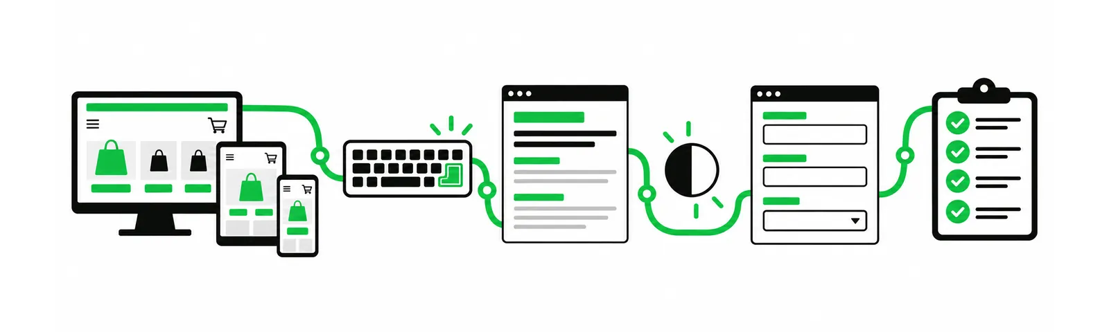
European Accessibility Act: start with the service you provide
The European Accessibility Act covers several products and services, including e-commerce services. The practical first step is to describe what your website does for a customer: sells goods, takes bookings, provides account access, delivers a subscription or supports another service.
National implementation matters. Irish guidance says that a microenterprise providing services may be exempt, while businesses dealing with products can have a different position. Do not treat that example as a Europe-wide exemption; confirm your obligations in the countries and business model that apply to you.
Implementation note: This is a practical website checklist, not legal advice. Scope and enforcement can depend on national law, the service offered and the role of the business. See the European Commission overview and qualified local advice when a legal decision is required.
Run an accessibility audit that follows a customer
An audit is easier to act on when it follows a real task. Pick one path, such as finding a product, adding it to the basket, checking delivery information and placing an order. Test it with keyboard navigation, a screen reader where possible, a narrow viewport and a zoomed page.
- Keyboard path: every interactive control receives focus, the indicator is visible and the order makes sense.
- Structure: headings describe the page and landmarks are meaningful.
- Text and contrast: normal text has sufficient contrast and instructions do not rely on colour alone.
- Resize: content remains available when text is enlarged or the viewport narrows.
- Media: useful images have concise alternative text and decorative images are ignored.
- Errors: forms identify the problem in text and tell the customer how to fix it.
The current WCAG 2.2 guidance groups success criteria under perceivable, operable, understandable and robust principles.
Make the content usable before polishing the layout
A WordPress theme can look tidy and still make a task difficult. Check product names, delivery terms, consent choices, account instructions and error messages. Replace vague links with labels that make sense when read on their own.
Check headings in the editor and in the rendered page. Use real labels for fields and make status changes available to assistive technology. The W3C forms tutorial is a useful reference for labels, grouping and error feedback.
Give WooCommerce checkout its own test
Checkout concentrates important interactions on one page. Review country and address fields, required markers, payment options, delivery choices, coupon messages, order review and confirmation. A customer should know what failed, what was accepted and what happens next.
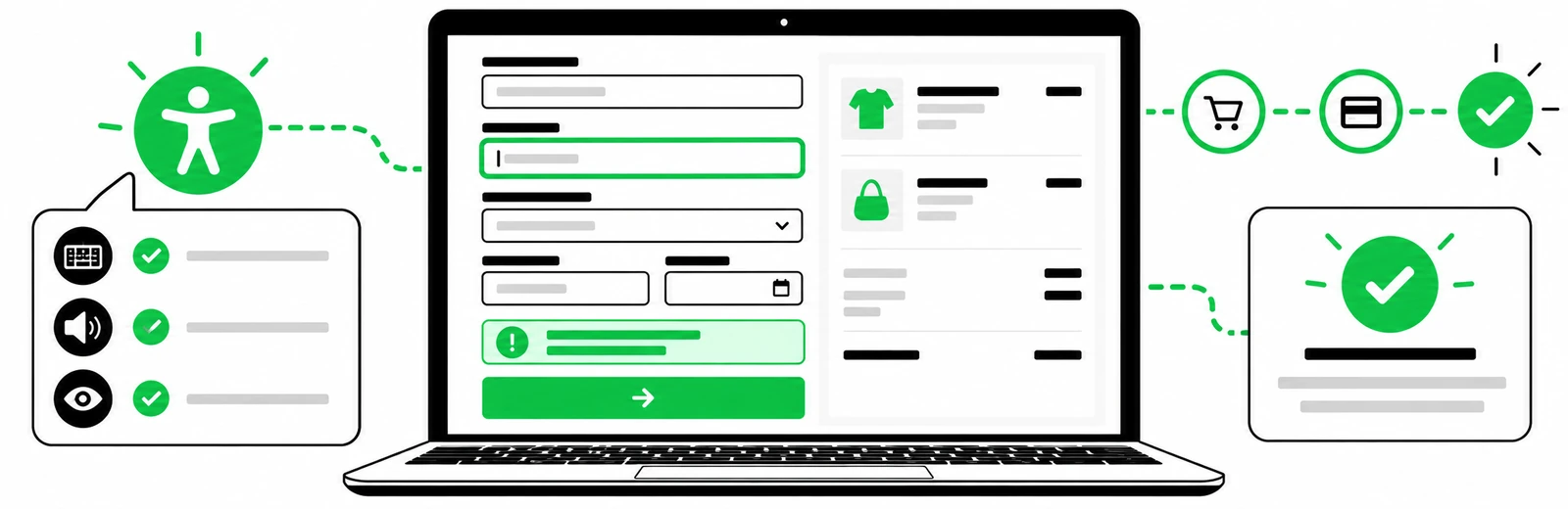
- Use real form labels connected to the right input.
- Make keyboard focus visible across address, shipping and payment steps.
- Announce validation errors and place the user near the field needing attention.
- Keep the order summary readable when text is enlarged.
- Test third-party payment fields and consent tools.
- Send an accessible confirmation email with order number and support route.
Keep an evidence trail for each release
Accessibility is easier to maintain when it is part of the release routine. Keep an issue list with URL, barrier, affected task, owner and target date. Save keyboard or screen-reader test notes for important journeys. When a plugin or theme changes, repeat the relevant checks.
Automated scanners help with repeated checks, but they cannot judge every wording, focus order or customer decision. Pair automated checks with manual keyboard testing and a review by people who use assistive technology when appropriate.
Build accessibility into WordPress components, not just individual pages
WordPress accessibility work becomes easier to maintain when the team checks reusable components as well as finished pages. Review the theme header patterns used inside the content area, navigation controls, accordions, tabs, modals, carousels, cookie controls and any block patterns that editors can reuse. A single inaccessible component can create the same keyboard, focus or screen-reader problem across dozens of URLs, so fixing the source component is usually more durable than patching each page separately.
For a practical WordPress accessibility checklist, include editor behaviour too. Confirm that content authors know how to write meaningful link text, use headings in a logical order, add useful image alternative text when an image carries information, leave decorative images without misleading descriptions, and avoid publishing text inside images when ordinary HTML text would work. These editorial controls support accessible WordPress content and reduce the chance that new pages reintroduce old barriers.
- Theme and block review: test reusable patterns at 200% zoom, with a keyboard and on a narrow viewport.
- Plugin review: pay special attention to forms, consent tools, search, filters, pop-ups and account interfaces.
- Focus behaviour: confirm that opening and closing overlays moves focus predictably and never traps the user.
- Content alternatives: check images, icons, downloadable documents, video captions and any instructions that rely on colour or position alone.
Create a repeatable WordPress and WooCommerce accessibility test matrix
A repeatable test matrix turns accessibility from a one-time audit into a release process. List the templates and customer journeys that matter most, then define the manual and automated checks required for each one. For a WooCommerce accessibility review, that normally means product discovery, product variation selection, basket updates, coupon feedback, account login, address entry, shipping choices, payment, order confirmation and transactional messages. For a service website, the critical journey may instead be search, service-page navigation, a contact form and a booking or enquiry confirmation.
Record the browser, viewport, keyboard path, assistive technology when used, result, issue owner and retest date. This makes WCAG 2.2 testing easier to repeat after theme, plugin and content changes. It also gives developers a clearer defect report because the issue is tied to a reproducible task rather than a vague statement that a page is “not accessible.”
- Choose representative page templates and one high-value customer journey.
- Run automated checks to catch repeatable issues such as missing names, invalid relationships and some contrast failures.
- Complete the same journey with keyboard-only navigation and visible focus.
- Check zoom, reflow, form errors, status messages and dynamic updates.
- Retest after the fix and save the result with the release notes.
Treat accessibility and SEO as related quality work, not the same task
Accessible websites and search-friendly websites share several useful practices: semantic HTML, descriptive headings, understandable links, meaningful alternative text, clear page structure and content that can be interpreted without visual guesswork. Those overlaps can improve maintainability and make important information easier for users and search systems to understand. Accessibility compliance, however, cannot be reduced to SEO checks, Lighthouse scores or an automated scanner. A technically indexable page can still fail a keyboard user, and an accessible interaction can still sit on a page with weak search intent or poor content.
For WordPress and WooCommerce teams, the practical approach is to keep the disciplines connected but separately testable. Use technical SEO checks for crawlability, canonicalisation, internal links and rendered content; use accessibility testing for keyboard access, semantics, forms, errors, contrast, focus and assistive-technology behaviour. That produces stronger release evidence without treating one checklist as a substitute for the other.
Fix the highest-friction path first
Fix missing labels, trapped focus, unreadable contrast, broken error feedback and inaccessible payment or consent controls before low-impact polish. Then retest the full journey after code, theme or content changes.
A support plan can keep checks alive after the first project. Blyfa’s website support service covers ongoing updates, while its web design service can address structure and responsive presentation.

Short comments related to this article.